BrightGauge is a BI tool from ConnectWise that puts essential information in one place, providing visibility for more informed decisions. The user can customize BrightGauge dashboards and sync other business tools in its BI dashboard software for ultimate visibility. Users can also display data with embeddable gauges on public sites.
$325
per month
QlikView
Score 7.2 out of 10
N/A
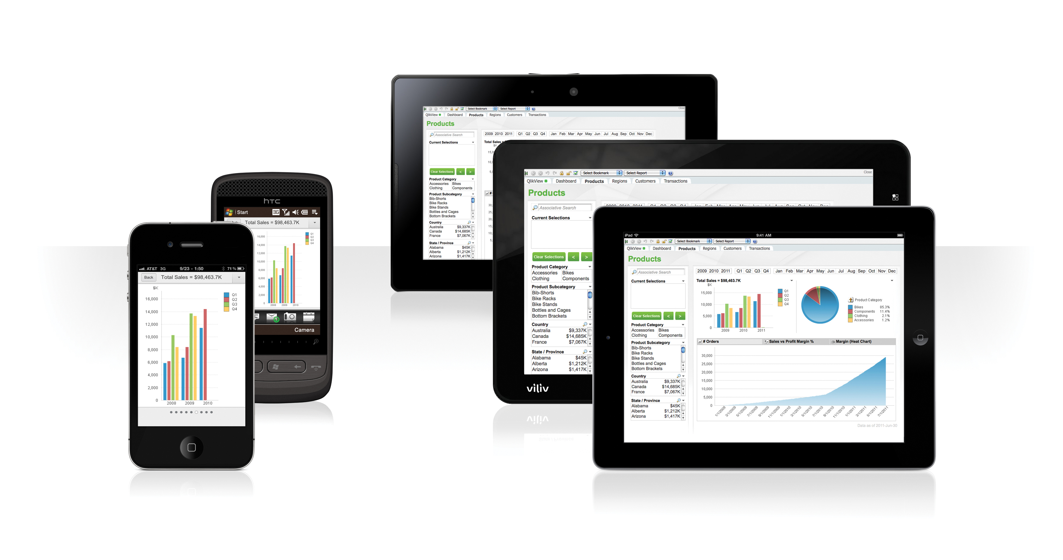
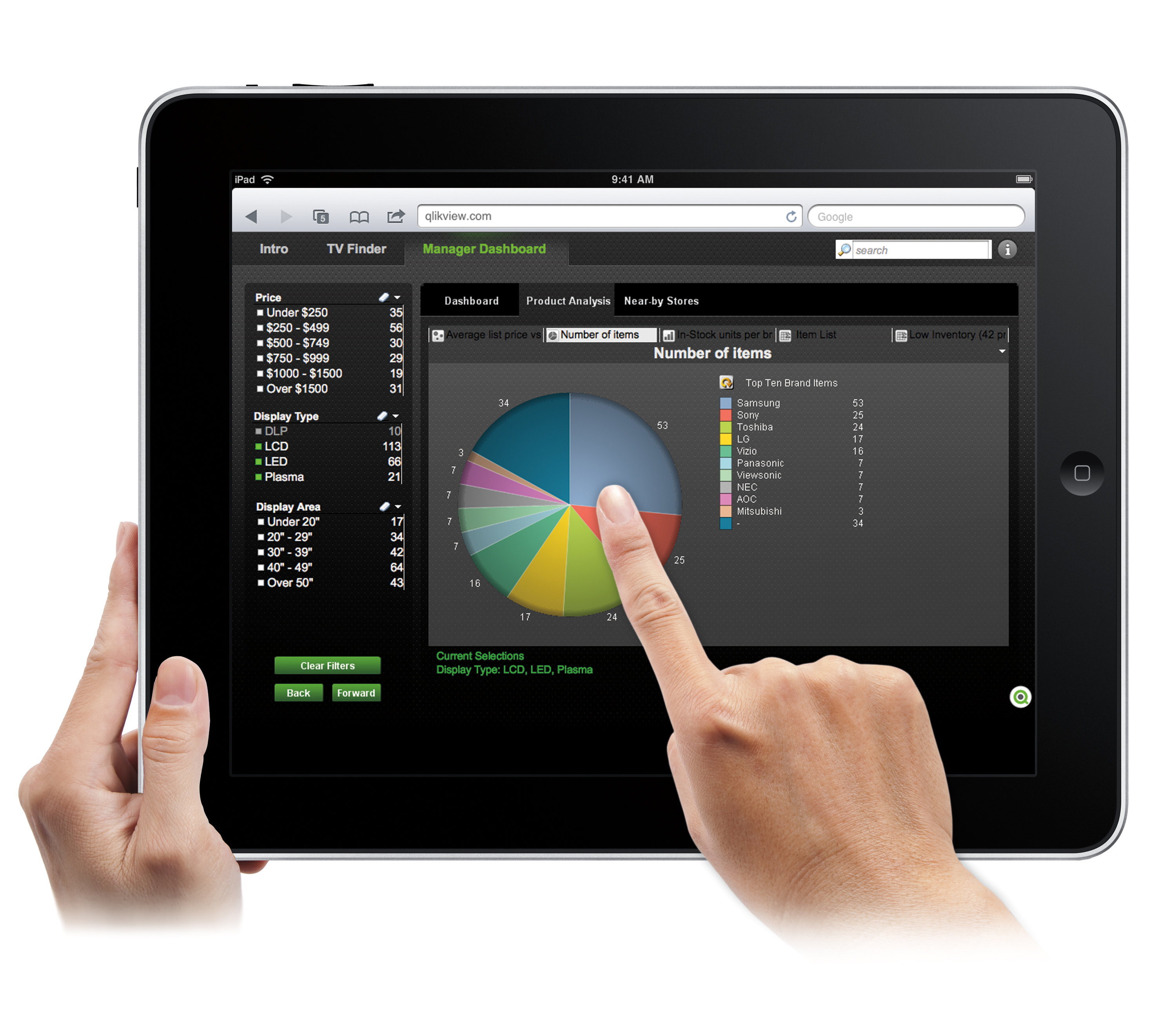
QlikView® is Qlik®’s original BI offering designed primarily for shared business intelligence reports and data visualizations. It offers guided exploration and discovery, collaborative analytics for sharing insight, and agile development and deployment.
N/A
Pricing
BrightGauge
QlikView
Editions & Modules
Standard
$325
per month
Enterprise
$449
per month
Enterprise+
$635
per month
QlikView
Custom
per user
Offerings
Pricing Offerings
BrightGauge
QlikView
Free Trial
No
Yes
Free/Freemium Version
No
No
Premium Consulting/Integration Services
No
No
Entry-level Setup Fee
$499 one-time fee
Optional
Additional Details
Set up fee is waived for Enterprise+ customers. A discount is offered for annual billing.
On an perpetual license basis, based on server plus number of users.
Contact vendor for pricing.
More Pricing Information
Community Pulse
BrightGauge
QlikView
Features
BrightGauge
QlikView
BI Standard Reporting
Comparison of BI Standard Reporting features of Product A and Product B
BrightGauge
8.1
Ratings
1% below category average
QlikView
8.0
Ratings
2% below category average
Pixel Perfect reports
8.20 Ratings
8.10 Ratings
Customizable dashboards
8.80 Ratings
8.00 Ratings
Report Formatting Templates
7.10 Ratings
8.00 Ratings
Ad-hoc Reporting
Comparison of Ad-hoc Reporting features of Product A and Product B
BrightGauge
7.7
Ratings
5% below category average
QlikView
8.3
Ratings
3% above category average
Drill-down analysis
8.40 Ratings
9.00 Ratings
Formatting capabilities
8.50 Ratings
7.00 Ratings
Integration with R or other statistical packages
4.70 Ratings
8.30 Ratings
Report sharing and collaboration
9.20 Ratings
9.00 Ratings
Report Output and Scheduling
Comparison of Report Output and Scheduling features of Product A and Product B
BrightGauge
7.9
Ratings
5% below category average
QlikView
7.9
Ratings
5% below category average
Publish to Web
9.40 Ratings
8.00 Ratings
Publish to PDF
7.40 Ratings
9.00 Ratings
Report Versioning
5.00 Ratings
7.50 Ratings
Report Delivery Scheduling
9.20 Ratings
7.30 Ratings
Delivery to Remote Servers
8.50 Ratings
00 Ratings
Data Discovery and Visualization
Comparison of Data Discovery and Visualization features of Product A and Product B
BrightGauge lets us know when we have critical issues that need solving. A massive influx of tickets all at the same time triggers an investigation. Usually, it is tied to a server going down, which we can address. It would not be helpful for a small MSP or IT department with just a few daily tickets. The stats are better used to track a large amount of clients.
Sales data validations have helped manage our justifications in the past, especially with regard to new product development and new business introduction. It has also been helpful in identifying trends with business impact and direction specific to quarter and monthly sales from ERP data as well as decisions to purchase equipment of staffing based on run rates and product demand.
One thing that can get out of hand is data output - if you aren't careful in your query, you may be overloaded with data dumps and drown in the amount of info you have to filter through. This is a user caution, not a comment on the software itself.
We found that QlikView can be a bit slow in supporting some forms of encryption. It is web-based and we needed to upgrade all of our server to not support the older SSL and TLS 1 protocols, only support TLS 1.2 and TLS 1.3. However, QlikView could not run with TLS 1.2 and TLS 1.3. We had to wait over six months to get a version that would handle the newer TLS versions.
There are so many options with QlikView that you can get lost when developing a visualization. There are still items I have not yet figured out, such as labeling a graph with the name of a selected detail item.
QlikView works by pulling the data it is going to use for visualization into its database. I am a security reviewer and I need to make certain that PII and PHI is not pulled by QlikView for a visualization, otherwise this could become a reportable indecent.
Ease of use, ability to load from pretty much any data source. today I created an application that loaded time sheets from excel that are not in a table format. With Qlik's "enable transformation steps" I was able to automate loads of multiple spreadsheets and multiple tabs easily. Could not do that with any other tool.
Usability is BrightGauge's strength. Granting the ability of virtually any user to be able to create a dashboard is incredibly valuable. If an organization very simple and straight forward reporting needs then BrightGauge is a perfect fit for them. Connecting to the dataset we used was very quick and easy and I imagine it would be the same for any major data source you would like to pull from.
I do think there is a steep learning curve to the program and that it requires a high level of experience or a data scientist background to fully take advantage and implement dashboards, and users will require ongoing training to maximize ROI, but it is absolutely worth it considering the impact it can make on an organization.
We did not need to use BrightGauge's support for the entire time that we used it. Best support is always the one that isn't needed because nothing breaks.
The documentation presented by QlikView is very clear and exact. This makes the process of implementation more easy. If any questions arise while creating the reports it is very easy to access the QlikView documents through the internet. QlikView also has a Qlik Community, full of different questions and answers. This helps a lot to resolve issues even without contacting the support team.
My team attended, but I cannot myself rate, but I think it was good as they've successfully launched a training program at our company themselves for users. It was 3-4 day training.
Training was as expected. The demo environments tend to be more fully featured that our own environment, but the training was clear and well delivered.
It has taken some time to get used to Qlikview and the backend team behind it. From understanding the new regulations on using less images and also pushing for more tools (such as full compatibility on desktop, laptop, ipad, phone). We were given training on this and have helpful tips to find analytics behind Qlikview but it is very much also a learn as you implement system.
I'm not aware of any other competitors to Bright Gauge that we selected. They seem to be very close to managed IT service providers and have been great at tailoring their support to the PSAs like ConnectWise, AutoTask, etc. I can see Bright Gauge getting more and more popular as time goes by
With QlikView and Qlik Sense the users can answer their own questions more interactively. They also can build their own visualizations without waiting [for] someone from IT to create a new report. The users can navigate through the data finding out relevant information. Through QlikView color code, users can get aware of the relationship between the different data points.
For larger customers, the dashboarding has helped our customers to remain sticky and add services/revenue to our MSP. They want to add more fragments of their IT for the 1 pane rollup.
From a leadership perspective, BG has allowed me to make difficult staffing decisions with confidence. Detailed metric driven decisions on who is hitting KPIs/who isn't - as well as when data proved we were overstaffed and understaffed.
Speed to market is the really big thing. You can attach to multiple data sources quickly and build a consumable model for a dashboard. It doesn’t require IT talent to build. We have built more dashboards and added more users in the last year, then in our entire history. I was at a company of 30k+ employees before, and we didn't have near this level of BI adoption.
As a result, we are seeing benefits across business function. For example, within sales, our pipeline has much more visibility. It allows for much faster decisions on things like quotas. One of our biggest power users is in sales ops. She feels her dashboards load 10x faster than our previous tool and she can make changes on the fly.