TrustRadius: an HG Insights company

LT Browser

Score9.5 out of 10

16 Reviews and Ratings

What is LT Browser?

LT Browser allows users to test the mobile view of a website on different screen sizes and resolutions. With over 50+ devices to choose from, LT Browser aims to make mobile website testing easier, and ensure that a website is mobile responsive. Users can create their own custom devices and save it for future uses.

Create new mobile, tablet or desktop devices and test a website on various devices, screen resolution and perform screen resolution test for website on different screen sizes. Users don’t have to switch between two devices to perform a mobile website test. Test on two devices simultaneously with LT Browser to perform mobile website testing further enabling website inspection and testing on the go. LT Browser comes with Dev Tool to debug multiple devices while performing a responsiveness test on devices simultaneously. Test website on various devices simultaneously with separate DevTools for each device.

Media

LT Browser Application Main Screen
Select Devices to compare and start testing
Create custom device with a desired resolution to test on
Scroll Sync to compare your website
Simulate different network profiles
Record videos and share across the team
Inbuilt debugging tool
Integrations with the tools you love

1 / 8

Best for website testing.

Use Cases and Deployment Scope

LT Browser is one of the main tools I use to perform UI tests on the websites I develop; I find it very useful because it has a large number of tools to evaluate various situations to which my website could be exposed and thus seek UX improvements to enhance my sites.

Pros

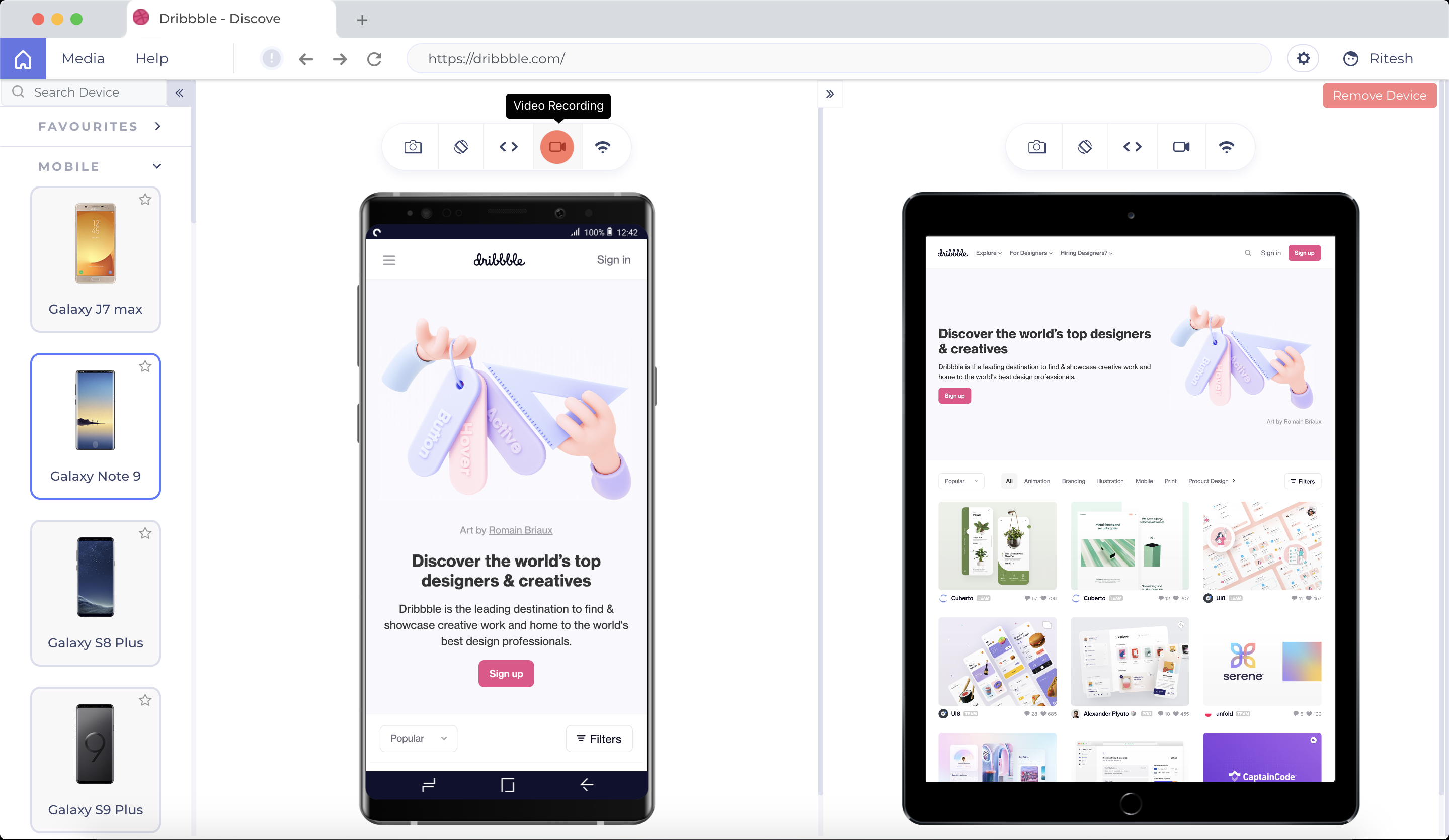
  • View websites with multi-device views.
  • Perform website performance testing.
  • Be friendly to new users.

Cons

  • Improve some UI issues to make it easier to access certain tools or features already available.
  • Add the possibility of viewing sites from different internet browsers, as it is allowed in the Lamda test.
  • Adapt to the OS theme.

Most Important Features

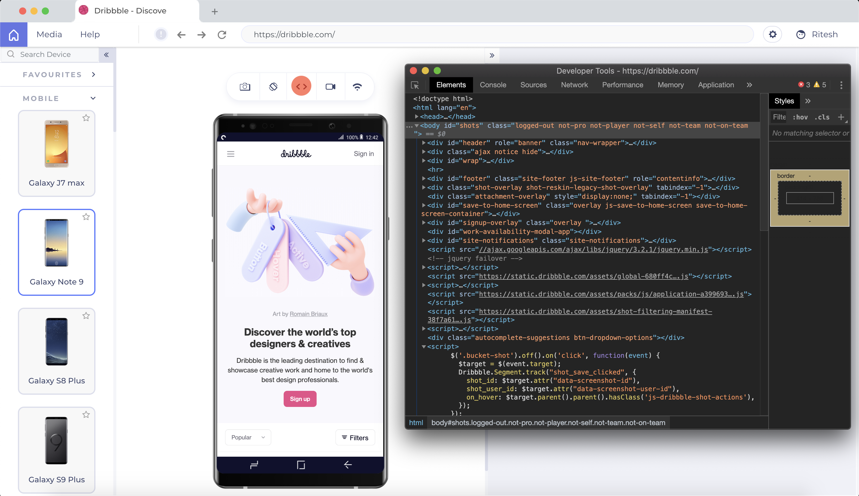
  • The number of tools included.
  • How easy it is to use.
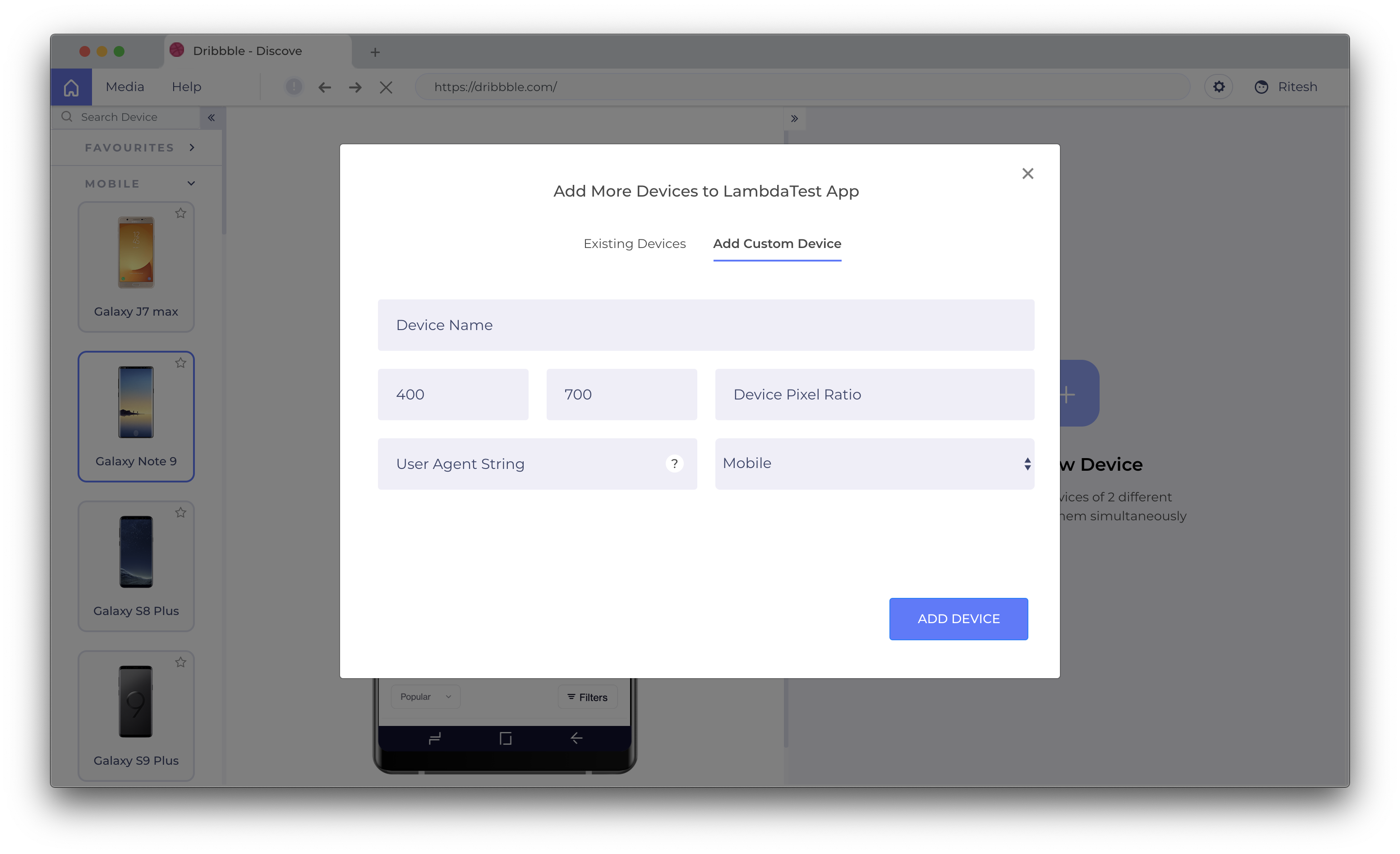
  • The number of preconfigured devices.
  • The chance to take screenshots or videos.

Return on Investment

  • It has helped me to improve the testing I do on my websites.
  • It allows me to better optimize the UI.
  • It allows me to improve the UX of my sites.

Alternatives Considered

Chrome DevTools and UserWay

Other Software Used

Chrome DevTools, UserWay

Apt tool for performance and responsive testing

Use Cases and Deployment Scope

This tool's simplicity and cleanliness will be very beneficial to our development team. Thanks to this application, we are able to test the websites of our clients at higher resolutions and with specific device settings. Utilizing scroll sync, it is easy to test responsiveness on the newest devices with LT Browser. It offers mirroring operations for viewing two different devices. The elements that really jumped out to us, though, were the developer tools, which let us make changes and quickly see how they were reflected.

Pros

  • Anyone on the team can get started with responsive testing since it is so simple to use.
  • The interface is very easy to use.
  • You can record the bug and share it with your team so that you can work together on it.

Cons

  • It would be great if they added the ability to export performance reports as a PDF or Word document.
  • Difficult to test on different browsers.

Most Important Features

  • Uses the feedback board to share your ideas with the rest of the team.
  • Produces error reports on the move to troubleshoot any issue.
  • Widgets and pop-ups are easily supported.

Return on Investment

  • Anyone on the team can get started with responsive testing since it is so simple to use.
  • You can record the bug and share it with your team so that you can work together on it.
  • It would be great if they added the ability to export performance reports as a PDF or Word document.

Best tool to check responsiveness of mobile sites

Use Cases and Deployment Scope

We can check the responsiveness of the mobile website on multiple mobile devices parallelly. Although, they have the latest mobile device screens for testing purpose. I have tried 4 different software's before settling with LT Browser. I like the option of custom resolutions and its integration with Jira and Asana for bug tracking. Main reason is the mix of performance and responsive testing. Feature-packed software with a user friendly UI. One of the most important feature is one click performance report and side by side view with separate debugger for both the screens. It has provision to add device with custom type resolutions. We can also share the google lighthouse reports.

Pros

  • Integration with Multiple bug tracking tools
  • Test mobile sites with different resolutions and screen sizes
  • User friendly user interface
  • slack integration for sharing

Cons

  • Geolocation feature is not present
  • We can test on only two devices side by side. It should be more than two.
  • Only 30 minutes access in free plan

Most Important Features

  • slack integration for sharing
  • Integration with Multiple bug tracking tools
  • Test mobile sites with different resolutions and screen sizes
  • Interactive user interface

Return on Investment

  • Saves a lot of time in testing mobile site
  • Increases customer satisfaction
  • Ease of use and debugging tools to quickly debug many devices and browsers

Alternatives Considered

Postman and TestFlight

Other Software Used

TestFlight, TestComplete, Slack

Perfect and convenient tool for UI/UX developers

Use Cases and Deployment Scope

As a developer, I can attest that the LT browser is the ideal tool for writing clear code and advancing to the responsiveness stage of a website. The ability to test your website locally without having to install any extensions is one of the main justifications for this. Given that the UI is so clean and provides a device comparison view, this functionality has helped both our test team and me write better code.

Pros

  • Built-in debugging include the ability to modify and validate errors in real time.
  • Provides the option to build bespoke devices and more than 25 devices to test on.
  • Device comparison view is available.
  • Integration with JIRA.

Cons

  • It would be better if geolocation testing would be available.

Most Important Features

  • Modernized preset devices, built-in custom resolution.
  • The user interface is clear and simple.
  • To mirror activities in the device comparison view, uses the Scroll Sync function.

Return on Investment

  • Additional benefits of the built-in debugging include the ability to modify and validate errors in real time. You can access the website by entering the localhost URL.

Mobile application development is easy and promising.

Use Cases and Deployment Scope

The LT browser makes responsive testing easier by providing a straightforward interface with side-by-side comparative views and mirrored interactions. We were able to test our clients' websites on larger resolutions with custom device options thanks to this tool. It works together with Lighthouse to deliver real-time website performance metrics based on the devices we like to test. It makes responsive testing very easy and now we can begin testing our web pages on local environments simply by adding the URL.

Pros

  • The user interface is rather simple to use.
  • Integrations with JIRA and Slack.
  • Records the bug, captures it, and shares it with the team.

Cons

  • Would love to be able to test on the not so popular browsers.

Most Important Features

  • Integration with communication tools.
  • Synchronized interactions are possible by having two screens side by side

Return on Investment

  • .

Other Software Used

Atlassian Jira Align (formerly AgileCraft), Slack