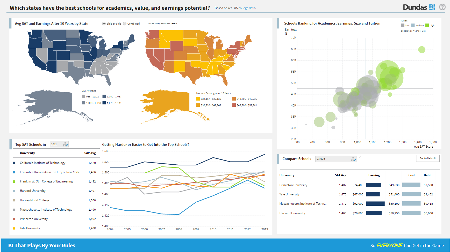
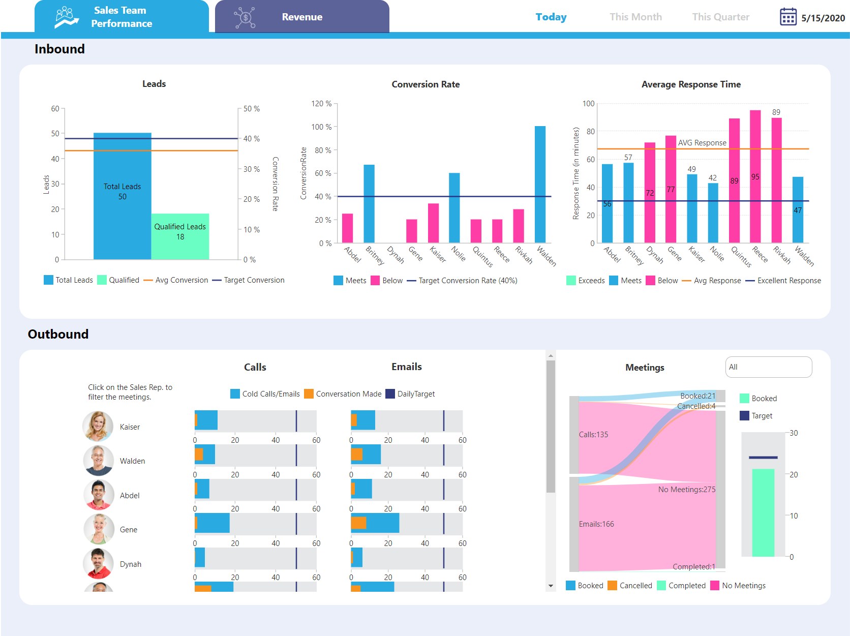
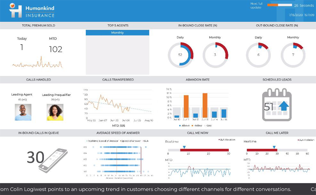
Logi Symphony is a business intelligence and data visualization software that includes customizable dashboards, reporting, and visual data analytics. It can be integrated into users’ existing business applications and its visualization and reporting tools can be customized.
N/A
Yellowfin
Score8 out of 10
Mid-Size Companies (51-1,000 employees)
Yellowfin is a cloud-based business intelligence and dashboarding platform.
A de minimis incentive was given to thank the reviewer for their time. The incentive was not used to bias or drive a particular response, nor was the incentive contingent on a positive endorsement. More Info
Senior Analyst in Information Technology at The TJX Companies, Inc. (Information Services, 501-1000 employees)
Chose Logi Symphony
We were comparing Dundas BI against several other programs and eventually decided to go with Oracle as we were already using a host of their other products. Dundas was just as robust, we were just using more Oracle products and they all fit together very smoothly.
A de minimis incentive was given to thank the reviewer for their time. The incentive was not used to bias or drive a particular response, nor was the incentive contingent on a positive endorsement. More Info
Managing Director in Professional Services at 9Dots Management Corp. (Computer Software, 11-50 employees)
Chose Logi Symphony
It is much more powerful to build more interactive and feature rich dashboards. Most of the above are great at ad hoc analysis but not for providing a full feature and rich guided dashboard experience. Dundas BI is great to build a suite of dashboards and easy to deploy …
A de minimis incentive was given to thank the reviewer for their time. The incentive was not used to bias or drive a particular response, nor was the incentive contingent on a positive endorsement. More Info
Business Software Support and Development (BSSD) Manager in Information Technology at Mblox (Telecommunications, 201-500 employees)
Chose Logi Symphony
Dundas BI stacks up well in functionality with all contenders that where evaluated. Where Dundas BI really provided value was with taking the level of functionality with the license structure. This pushes the value structure squarely toward Dundas BI.
A de minimis incentive was given to thank the reviewer for their time. The incentive was not used to bias or drive a particular response, nor was the incentive contingent on a positive endorsement. More Info
For all the scenarios I have so far worked on or I am currently working on, Dundas BI has proved to be more than adequate and apt to handle all of those. It is a very easy-to-use tool with quick shortcuts enabling you to prepare ad-hoc reports or dashboards in a matter of minutes.
A de minimis incentive was given to thank the reviewer for their time. The incentive was not used to bias or drive a particular response, nor was the incentive contingent on a positive endorsement. More Info
We can recommend this software without hesitation, as it has the ability to generate reports and data analysis, as well as process the data automatically, which saves time. It is ideal for small and medium-sized companies that wish to improve their services in the business world
A de minimis incentive was given to thank the reviewer for their time. The incentive was not used to bias or drive a particular response, nor was the incentive contingent on a positive endorsement. More Info
Project organization from Development to Production, you get a production and development license but I think the best way to do it is with DEV and Prod project in the Production box. Use the development box for testing updates and really crazy things. With the Dev and Prod projects on the same box, you just publish from Dev to Prod and you are done. Users only have access to the Prod projects so no one can mess up what you are working on.
Security - If you have a hierarchy (subsidiaries, divisions, department, teams) and you want each group to see only their data, then Security hierarchies are for you!
Dependent filters! What's this you ask? Here is an example of how it can be used, in your company you have departments and who works for what department is in your database. You make a dashboard that has a department filter (only show these departments), a managers filter, and employee filter. Not every manager or employee is in multiple departments usually only one. With dependent filters you can say that the manager and employee filter are dependent on what is selected in the departments filter so when you go to filter them they only show the managers or employees that are part of that department, and you can even it do so employees are not only dependent on department but on manager as well. Then it gets even better as it can be done in reverse as well so when you select a manager then go to the department it only shows the departments he works for (there are better situations where this is more useful).
It is scriptable! From calculate columns, null replacements, button actions, load actions, hover over events there a way to do what you want.
They are constantly improving and listens to your suggestions.
A de minimis incentive was given to thank the reviewer for their time. The incentive was not used to bias or drive a particular response, nor was the incentive contingent on a positive endorsement. More Info
Yellowfin’s Storyboard, Timeline and Collaborative tools make it easy to share data and insights across an organisation.
Strong Operational and Executive Dashboards that reflect the business KPIs and can send out prompts to people within the business based on rules.
Yellowfin makes it incredibly easy to create dynamic reports and dashboards which incorporate maps through locational intelligence functionality.
Yellowfin is a single license and all access is via a web browser making it perfect for both on-premise and cloud deployment. Mobile apps are also available.
User roles and source filtering allows Admin/IT to offer different functions/views by user group/role.
Mobile BI applications to support any device ..
API connectors ( YF 7.2 on the way in Mar16 ) for a range of third-party Web-based applications, data sources, Enterprises CRM/ERP apps & open data platform apps, including Salesforce, Google Analytics, Twitter, Youtube , Zoho CRM, XE.com & more coming to make endusers to integrate their applications for better benefits
Yellowfin Integration with Predictive analytical and Big Data processing tools like R, UDF, Spark to build rich applications for end users
Not too many cons for how we use the application. It really is easy and powerful. Very powerful.
Licensing is one thing that could be looked into. It is simple, but a little confusing. For example, if I get a license today, but a new release comes out tomorrow, it seems that the license doesn't work with the new release. Maybe that is by design, but it would be nice to clearly understand.
The ability to predefine a colour for a specific graph as a selection option dynamically.
The ability to customise the label of a chart, especially with respect to performance related reporting graphs we need an increase in dynamic charting options to meet our more specialised requirements.
We are still in the implementation phase, but so far we are finding it to be easy to use and learn. The eLearning courses that they have made available for free, as well as User Forums and other training videos have made even difficult concepts easier to understand.
As mentioned previously, if a newer company is looking for a strong, polished BI tool, Yellowfin would be a great software vendor to consider. Unfortunately, the high cost might be a barrier to these newer companies who dont have any legacy software/agreements such as an EA agreement with Microsoft.
A de minimis incentive was given to thank the reviewer for their time. The incentive was not used to bias or drive a particular response, nor was the incentive contingent on a positive endorsement. More Info
We have bi-weekly calls with our Success Manager, as well as access to support as needed. Any question that I have had, multiple people have been willing and able to jump on a call to talk me through it, or send an email with the solution
They have good support in what they provide. But what they provide is not what is promised. I would stay with them if I can. Be very careful before signing up with them. They are not what they seem in the sales pitches. Be very careful and make sure you test and test before you sign up.
Per dollar spent, it offers the widest range of features of the tools that we evaluated. It offers lots of options for how to configure your environment, though they are not always intuitive to figure out. Having an ETL layer was a must have for us, as well as the ability to host to secure HIPAA compliance. It is not a replacement for ad hoc reporting, but does a great job of creating parameterized reports and dashboards that look great.
A de minimis incentive was given to thank the reviewer for their time. The incentive was not used to bias or drive a particular response, nor was the incentive contingent on a positive endorsement. More Info
Yellow Fin platform is browser agnostic and is accessible from desktops as well as mobile devices. It is very simple and fast, it is integrated with Big Data, clients do not require a great training. It just works. But it’s easier to have things on the cloud, especially if you need to use different computers. Yellow Fin lacks the cloud feature.
A de minimis incentive was given to thank the reviewer for their time. The incentive was not used to bias or drive a particular response, nor was the incentive contingent on a positive endorsement. More Info
A de minimis incentive was given to thank the reviewer for their time. The incentive was not used to bias or drive a particular response, nor was the incentive contingent on a positive endorsement. More Info
A de minimis incentive was given to thank the reviewer for their time. The incentive was not used to bias or drive a particular response, nor was the incentive contingent on a positive endorsement. More Info