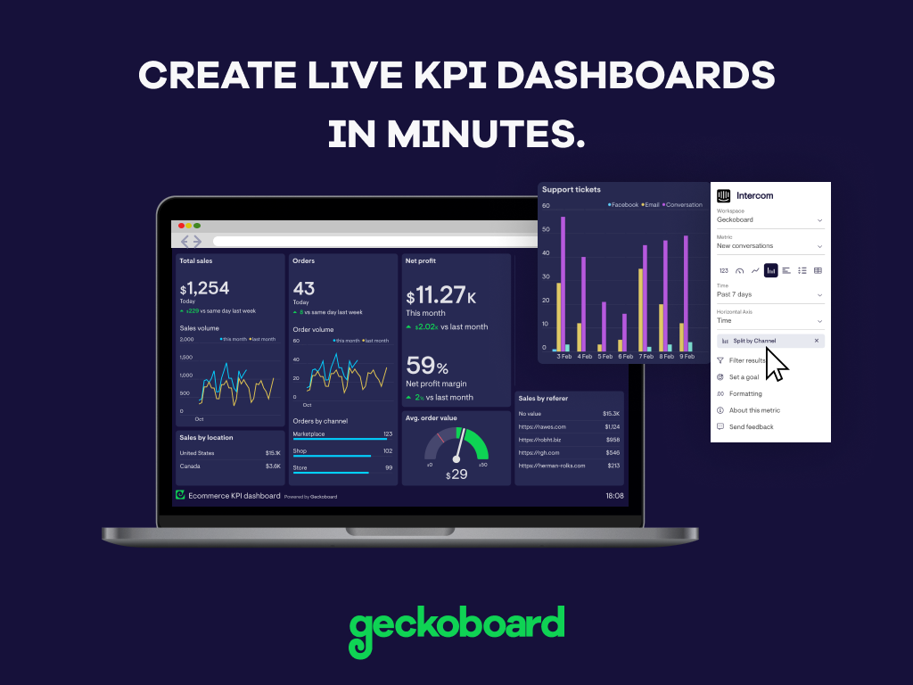
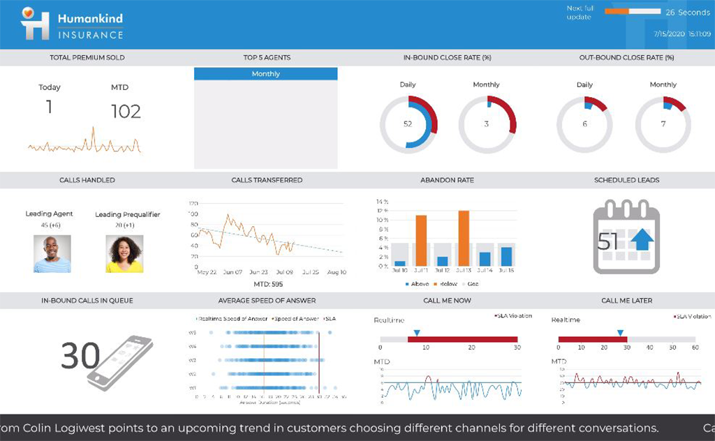
Geckoboard enables users to create real time dashboards using data from over 80 cloud services. It integrates with other products such as: AWeber, Basecamp, Campaign Monitor and HubSpot.
$35
per month
Logi Symphony
Score 8.9 out of 10
N/A
Logi Symphony is a business intelligence and data visualization software that includes customizable dashboards, reporting, and visual data analytics. It can be integrated into users’ existing business applications and its visualization and reporting tools can be customized.
N/A
Pricing
Geckoboard
Logi Symphony
Editions & Modules
Starter
$35
per month
Team
$159
per month
Team Plus
$275
per month
Company
$599
per month
No answers on this topic
Offerings
Pricing Offerings
Geckoboard
Logi Symphony
Free Trial
Yes
Yes
Free/Freemium Version
Yes
No
Premium Consulting/Integration Services
No
No
Entry-level Setup Fee
No setup fee
No setup fee
Additional Details
—
—
More Pricing Information
Community Pulse
Geckoboard
Logi Symphony
Features
Geckoboard
Logi Symphony
BI Standard Reporting
Comparison of BI Standard Reporting features of Product A and Product B
Geckoboard
9.3
Ratings
13% above category average
Logi Symphony
8.4
Ratings
3% above category average
Pixel Perfect reports
8.00 Ratings
8.40 Ratings
Customizable dashboards
10.00 Ratings
8.60 Ratings
Report Formatting Templates
10.00 Ratings
8.10 Ratings
Ad-hoc Reporting
Comparison of Ad-hoc Reporting features of Product A and Product B
Geckoboard
7.7
Ratings
5% below category average
Logi Symphony
8.1
Ratings
1% above category average
Drill-down analysis
8.00 Ratings
7.90 Ratings
Formatting capabilities
8.00 Ratings
8.20 Ratings
Integration with R or other statistical packages
7.00 Ratings
7.60 Ratings
Report sharing and collaboration
8.00 Ratings
8.60 Ratings
Report Output and Scheduling
Comparison of Report Output and Scheduling features of Product A and Product B
Geckoboard
9.0
Ratings
8% above category average
Logi Symphony
7.9
Ratings
5% below category average
Publish to Web
10.00 Ratings
8.40 Ratings
Publish to PDF
9.00 Ratings
7.80 Ratings
Report Versioning
9.00 Ratings
7.80 Ratings
Report Delivery Scheduling
8.00 Ratings
8.30 Ratings
Delivery to Remote Servers
9.00 Ratings
7.20 Ratings
Data Discovery and Visualization
Comparison of Data Discovery and Visualization features of Product A and Product B
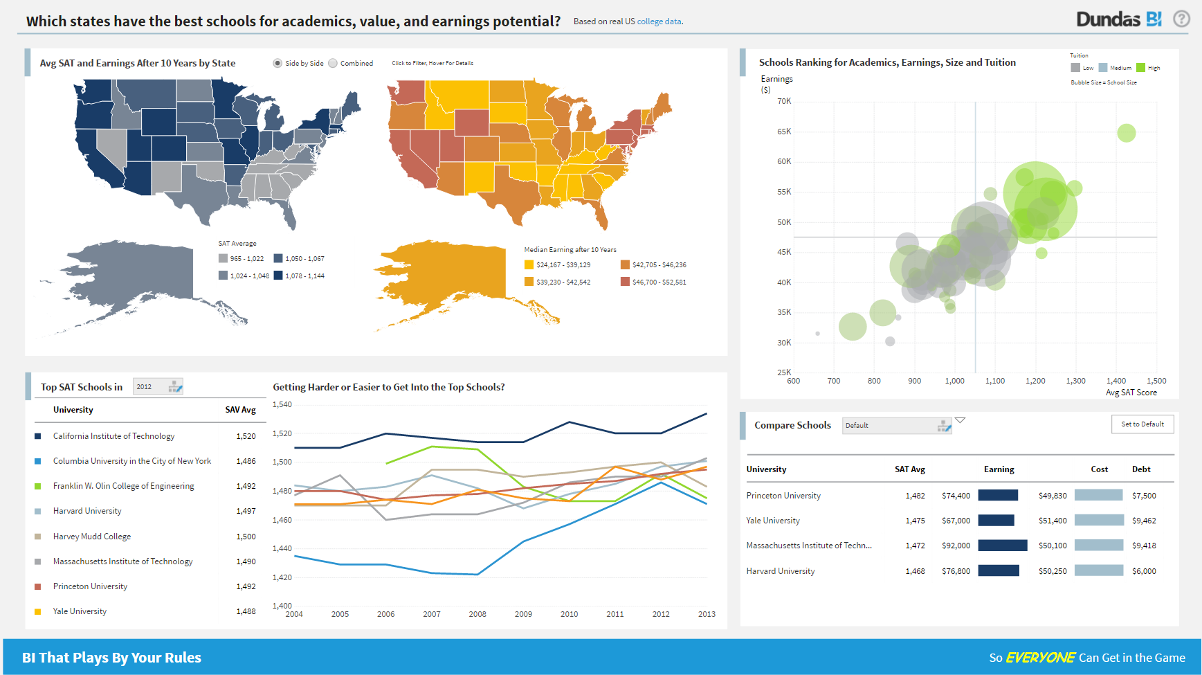
A beautiful UI, with visuals that interest even those that hate staring at data. It's well suited for small to medium-sized businesses/corporations in which high-level sharing of data between teams is required -- the larger the distance between teams, the better as it's a great tool for level-setting on complex data. It would be less appropriate for small businesses, or those that do not need to summarize complex data to share with those not familiar with the data source
Considering it's price point in the market, Dundas BI offers a lot of functionality. They are constantly adding features and bug fixes which is great, but also means there are always updates to take if you want everything to work as expected. The standard user interface is pretty easy to understand, but it takes a while for developers and power users to become independent of documentation.
Project organization from Development to Production, you get a production and development license but I think the best way to do it is with DEV and Prod project in the Production box. Use the development box for testing updates and really crazy things. With the Dev and Prod projects on the same box, you just publish from Dev to Prod and you are done. Users only have access to the Prod projects so no one can mess up what you are working on.
Security - If you have a hierarchy (subsidiaries, divisions, department, teams) and you want each group to see only their data, then Security hierarchies are for you!
Dependent filters! What's this you ask? Here is an example of how it can be used, in your company you have departments and who works for what department is in your database. You make a dashboard that has a department filter (only show these departments), a managers filter, and employee filter. Not every manager or employee is in multiple departments usually only one. With dependent filters you can say that the manager and employee filter are dependent on what is selected in the departments filter so when you go to filter them they only show the managers or employees that are part of that department, and you can even it do so employees are not only dependent on department but on manager as well. Then it gets even better as it can be done in reverse as well so when you select a manager then go to the department it only shows the departments he works for (there are better situations where this is more useful).
It is scriptable! From calculate columns, null replacements, button actions, load actions, hover over events there a way to do what you want.
They are constantly improving and listens to your suggestions.
Not too many cons for how we use the application. It really is easy and powerful. Very powerful.
Licensing is one thing that could be looked into. It is simple, but a little confusing. For example, if I get a license today, but a new release comes out tomorrow, it seems that the license doesn't work with the new release. Maybe that is by design, but it would be nice to clearly understand.
With a simple interface and available templates, creating basic dashboards is easy. Obviously depending on the data you want to visualize, there may be higher learning curves. That being said, they have a huge amount of integrations and extensible frameworks. If you are using anything made in the past ten years there is an API function or integration that can get it talking to the platform. As such, it's pretty easy to hit the main data points you want and get it on a cheap display in front of your team.
We are still in the implementation phase, but so far we are finding it to be easy to use and learn. The eLearning courses that they have made available for free, as well as User Forums and other training videos have made even difficult concepts easier to understand.
The support levels vary based on the level of plan that you have but that's to be expected. Virtually everything except the Enterprise plan has basic chat/email support. While they are responsive they are not going to be much assistance in helping you figure out API calls or implementing 3rd party integrations. That is to be expected and the support community can pretty much get you in the right direction if you look.
We have bi-weekly calls with our Success Manager, as well as access to support as needed. Any question that I have had, multiple people have been willing and able to jump on a call to talk me through it, or send an email with the solution
We are a Google shop and our Analytics and Reporting team have and use GDS. However, Geckoboard can output some of the same types of data (albeit maybe not as granular) and can be used by a wide swath of our users (including project managers, account execs, developers, etc.). We can also save and reuse boards for similar products and get our data in front of the eyes that need to see it quickly without a lot of fuss.
We have tested Tableau prior to Dundas BI and though Tableau is a great package in itself, Dundas BI is much more cost-effective for our needs and requirements and hence zeroed in on Dundas BI. We have also tried microstrategy but it has a very dated UI and doesn't suit our needs in today's more modern world
While we originally used this as an internal IS tool, we eventually have expanded it to be used by nearly every department.
Because pricing is monthly, we can grow or decrease our usage based on our current client needs.
Because it is low cost and easy to deploy, we can utilize it in place of considerable resources in analytics and reporting by delivering snapshots of data without pulling reports.