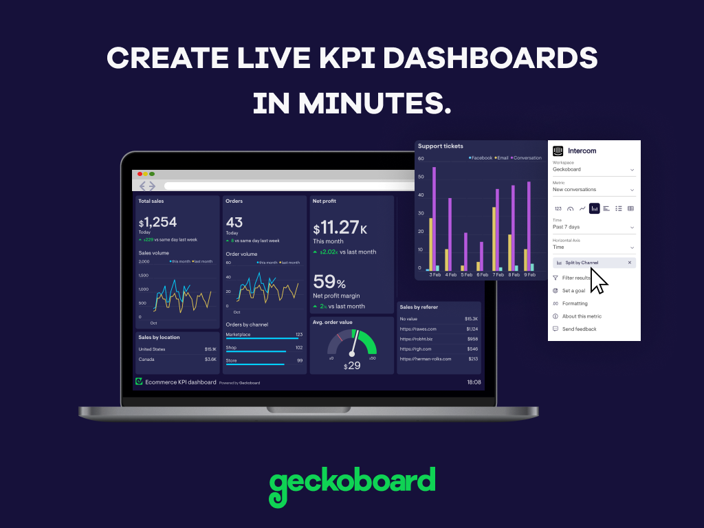
Geckoboard enables users to create real time dashboards using data from over 80 cloud services. It integrates with other products such as: AWeber, Basecamp, Campaign Monitor and HubSpot.
$35
per month
Google Charts
Score 7.0 out of 10
N/A
Google Charts provides a way to visualize data on your website - for free. From simple line charts to complex hierarchical tree maps, the chart gallery provides a large number of ready-to-use chart types. The most common way to use Google Charts is with simple JavaScript that you embed in your web page.
N/A
Pricing
Geckoboard
Google Charts
Editions & Modules
Starter
$35
per month
Team
$159
per month
Team Plus
$275
per month
Company
$599
per month
No answers on this topic
Offerings
Pricing Offerings
Geckoboard
Google Charts
Free Trial
Yes
No
Free/Freemium Version
Yes
Yes
Premium Consulting/Integration Services
No
No
Entry-level Setup Fee
No setup fee
No setup fee
Additional Details
—
—
More Pricing Information
Community Pulse
Geckoboard
Google Charts
Features
Geckoboard
Google Charts
BI Standard Reporting
Comparison of BI Standard Reporting features of Product A and Product B
Geckoboard
9.3
Ratings
13% above category average
Google Charts
8.8
Ratings
8% above category average
Pixel Perfect reports
8.00 Ratings
8.10 Ratings
Customizable dashboards
10.00 Ratings
9.50 Ratings
Report Formatting Templates
10.00 Ratings
8.80 Ratings
Ad-hoc Reporting
Comparison of Ad-hoc Reporting features of Product A and Product B
Geckoboard
7.7
Ratings
5% below category average
Google Charts
9.3
Ratings
14% above category average
Drill-down analysis
8.00 Ratings
8.60 Ratings
Formatting capabilities
8.00 Ratings
9.50 Ratings
Integration with R or other statistical packages
7.00 Ratings
9.50 Ratings
Report sharing and collaboration
8.00 Ratings
9.60 Ratings
Report Output and Scheduling
Comparison of Report Output and Scheduling features of Product A and Product B
Geckoboard
9.0
Ratings
8% above category average
Google Charts
9.0
Ratings
8% above category average
Publish to Web
10.00 Ratings
9.50 Ratings
Publish to PDF
9.00 Ratings
9.60 Ratings
Report Versioning
9.00 Ratings
8.60 Ratings
Report Delivery Scheduling
8.00 Ratings
8.70 Ratings
Delivery to Remote Servers
9.00 Ratings
8.80 Ratings
Data Discovery and Visualization
Comparison of Data Discovery and Visualization features of Product A and Product B
A beautiful UI, with visuals that interest even those that hate staring at data. It's well suited for small to medium-sized businesses/corporations in which high-level sharing of data between teams is required -- the larger the distance between teams, the better as it's a great tool for level-setting on complex data. It would be less appropriate for small businesses, or those that do not need to summarize complex data to share with those not familiar with the data source
Google Charts is perfectly suited for most presentations that are data oriented. There's not much of a limit on the type of table or chart you can create, and being able to integrate with Google Sheets just makes things even easier if you've already got the data stored somewhere. It works well on desktop browsers, Iphones, and Android phones. The only drawback I've been able to find is for those that prefer to have a desktop application.
I would like a couple more introductory videos or a live chat option for when you run into an issue. I think this is a Google-wide problem, not only linked to Google Charts.
I have run into some issues with the Dynamic Data but also admittedly could potentially dive in deeper and investigate.
It would be great if Google Charts made it possible to integrate Google Chat into the platform.
Google Charts is a good product. It's widely supported with deep documentation and a large community. But for me, it wasn't customizable enough. When we started with simple charts, it was great, but as we got deeper and more complex, our needs outgrew the library. If I was going forward, I would choose a more barebones library with more freedom and extensibility.
With a simple interface and available templates, creating basic dashboards is easy. Obviously depending on the data you want to visualize, there may be higher learning curves. That being said, they have a huge amount of integrations and extensible frameworks. If you are using anything made in the past ten years there is an API function or integration that can get it talking to the platform. As such, it's pretty easy to hit the main data points you want and get it on a cheap display in front of your team.
Requires knowledge of Javascript, which can be difficult for a beginner. A business analyst often isn't as technically minded as a developer so collaboration is often required to produce a correct chart for the purpose required. However, the customisation capable due to this creates much better looking charts compared to other tools.
The support levels vary based on the level of plan that you have but that's to be expected. Virtually everything except the Enterprise plan has basic chat/email support. While they are responsive they are not going to be much assistance in helping you figure out API calls or implementing 3rd party integrations. That is to be expected and the support community can pretty much get you in the right direction if you look.
Google Charts has a very good documentation that we can just go in there and find the stuff we need to implement our solutions on Google Charts. Plus, if we get stuck, we can also email the support and they are very responsive. So overall, the support is very satisfying.
We are a Google shop and our Analytics and Reporting team have and use GDS. However, Geckoboard can output some of the same types of data (albeit maybe not as granular) and can be used by a wide swath of our users (including project managers, account execs, developers, etc.). We can also save and reuse boards for similar products and get our data in front of the eyes that need to see it quickly without a lot of fuss.
In comparison to Microsoft Power BI, Google Charts has more ease of use for businesses who simply need a way to visually display their data from their reports. Although Power BI may be more robust in more complicated data compilation, Google Charts can still be able to do some of the basics that Power BI delivers.
While we originally used this as an internal IS tool, we eventually have expanded it to be used by nearly every department.
Because pricing is monthly, we can grow or decrease our usage based on our current client needs.
Because it is low cost and easy to deploy, we can utilize it in place of considerable resources in analytics and reporting by delivering snapshots of data without pulling reports.