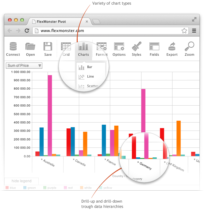
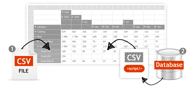
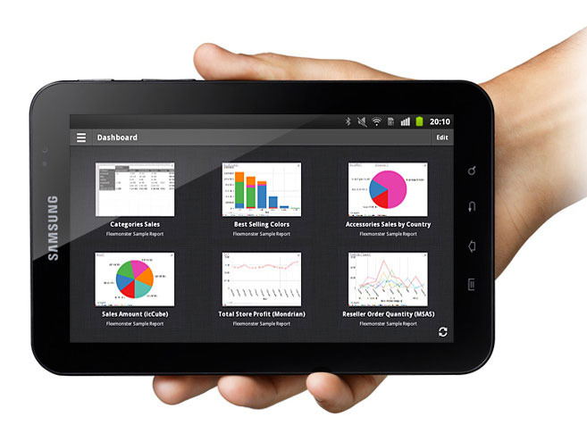
Flexmonster Pivot Table & Charts is a component for interactive pivot reports that can be inserted into a web page or a web application. It’s a JavaScript tool that enables a user to visualize their business data. This solution supports Microsoft Analysis Services OLAP cubes, Mondrian, icCube, JSON, SQL (MS SQL, MySQL and others) databases or static JSON or CSV files. According to the vendor, this solution allows users to work extremely quickly with really large data…
$0
Annual SaaS Subscription
Power BI For Office 365 (discontinued)
Score8.4 out of 10
N/A
Power BI for Office 365 allowed users to model and analyze data, and query large datasets with complex natural language queries. It has been discontinued in favor of other editions of Power BI going forward.
N/A
Pricing
Flexmonster Pivot Table & Charts Component
Power BI For Office 365 (discontinued)
Editions & Modules
Pivot Table for SQL/CSV/JSON Unlimited
$0
Annual SaaS Subscription
Pivot Table for Pentaho Mondrian
$0
Annual SaaS Subscription
Pivot Table for MS Analysis Services
$0
Annual SaaS Subscription
Pivot Table for SQL/CSV/JSON Basic
$299
Annual subscription
Pivot Table for Pentaho Mondrian
$799
Annual subscription
Pivot Table for SQL/CSV/JSON Unlimited
$799
Annual subscription
Pivot Table for MS Analysis Services
$799
Annual subscription
No answers on this topic
Offerings
Pricing Offerings
Flexmonster Pivot Table & Charts Component
Power BI For Office 365 (discontinued)
Free Trial
Yes
No
Free/Freemium Version
No
No
Premium Consulting/Integration Services
Yes
No
Entry-level Setup Fee
No setup fee
No setup fee
Additional Details
—
—
More Pricing Information
Features
Flexmonster Pivot Table & Charts Component
Power BI For Office 365 (discontinued)
BI Standard Reporting
Comparison of BI Standard Reporting features of Flexmonster Pivot Table & Charts Component and Power BI For Office 365 (discontinued)
Feature
Flexmonster Pivot Table & Charts Component
10.0
1 Ratings
20% above category average
Power BI For Office 365 (discontinued)
9.0
11 Ratings
10% above category average
Report Formatting Templates
10.01 Ratings
10.08 Ratings
Pixel Perfect reports
00 Ratings
9.010 Ratings
Customizable dashboards
00 Ratings
8.011 Ratings
Ad-hoc Reporting
Comparison of Ad-hoc Reporting features of Flexmonster Pivot Table & Charts Component and Power BI For Office 365 (discontinued)
Feature
Flexmonster Pivot Table & Charts Component
9.5
1 Ratings
16% above category average
Power BI For Office 365 (discontinued)
9.5
11 Ratings
16% above category average
Formatting capabilities
9.01 Ratings
9.011 Ratings
Report sharing and collaboration
10.01 Ratings
10.011 Ratings
Drill-down analysis
00 Ratings
9.011 Ratings
Integration with R or other statistical packages
00 Ratings
10.06 Ratings
Report Output and Scheduling
Comparison of Report Output and Scheduling features of Flexmonster Pivot Table & Charts Component and Power BI For Office 365 (discontinued)
Feature
Flexmonster Pivot Table & Charts Component
10.0
1 Ratings
18% above category average
Power BI For Office 365 (discontinued)
9.5
11 Ratings
13% above category average
Publish to PDF
10.01 Ratings
10.010 Ratings
Publish to Web
00 Ratings
10.011 Ratings
Report Versioning
00 Ratings
9.06 Ratings
Report Delivery Scheduling
00 Ratings
9.64 Ratings
Delivery to Remote Servers
00 Ratings
8.73 Ratings
Mobile Capabilities
Comparison of Mobile Capabilities features of Flexmonster Pivot Table & Charts Component and Power BI For Office 365 (discontinued)
Feature
Flexmonster Pivot Table & Charts Component
10.0
1 Ratings
24% above category average
Power BI For Office 365 (discontinued)
9.5
10 Ratings
19% above category average
Responsive Design for Web Access
10.01 Ratings
10.010 Ratings
Mobile Application
00 Ratings
9.09 Ratings
Dashboard / Report / Visualization Interactivity on Mobile
00 Ratings
10.09 Ratings
Data Discovery and Visualization
Comparison of Data Discovery and Visualization features of Flexmonster Pivot Table & Charts Component and Power BI For Office 365 (discontinued)
Comparison of Application Program Interfaces (APIs) / Embedding features of Flexmonster Pivot Table & Charts Component and Power BI For Office 365 (discontinued)
Fantastic product to embed in any SaaS solution for reporting and data exports. Excellent performance, ability to customize fields and tons of other features out of the box that makes it a well-rounded tool that is easy to use. To top it off their support is amazing for answering technical questions quickly and they provide great examples to learn how to interact with the code. We are very happy with our choice to use Flexmonster!
A de minimis incentive was given to thank the reviewer for their time. The incentive was not used to bias or drive a particular response, nor was the incentive contingent on a positive endorsement. More Info
If you're already using Office 365, Power BI for O365 is an easy choice. Start playing around with the free version and then easily add individual Pro licenses with little risk. However, if you anticipate using this with many users, it can get expensive quickly.
A de minimis incentive was given to thank the reviewer for their time. The incentive was not used to bias or drive a particular response, nor was the incentive contingent on a positive endorsement. More Info
Easy to make visual dashboards from SQL queries. Previously we had to use a third party application that had to run on a web server that was so complex to setup and run. PowerBI removes all that.
Ability to control who/which group has access to each dashboard or report. Ties in well with the rest of the Office 365 ecosystem.
Has many connectors to allow pulling data from various systems, both onsite (via gateway) or external (via APIs), and join the data to create a report/dashboard.
Ability to show data but also export the data, if permitted.
Easy to show PowerBI dashboards on SharePoint or on other websites via embedded code.
A de minimis incentive was given to thank the reviewer for their time. The incentive was not used to bias or drive a particular response, nor was the incentive contingent on a positive endorsement. More Info
Licensing: Currently, Microsoft has a fixed pricing model for Office 365 users, regardless of role/function of the user. Most organizations have a small number of "power users" that create usable content and many more "consumers" that simply view/run reports created by power users. Microsoft does not differentiate between these users, and thus the pricing limits organizations from large deployments of the software.
Version incompatibility: Excel 2010 and 2013 workbooks are compatible with each other. However, workbooks created in 2010 that include PowerPivot databases must be upgraded to 2013 format to run in 2013. Subsequently, you cannot open these upgraded PowerPivot workbooks in 2010. This requires ALL users to be on the same version.
Visualization: Excel charting with PowerPivot workbooks is adequate for many users. Power View also contains a number of GREAT visualizations, including animated bubble charts and a very flexible dashboard/report design canvas. However, compared to some of the other self-service BI solutions, it is still limited in its visualization capabilities.
I will continue to recommend this suite to folks looking for a reporting and analytics solution, as I find in MOST cases, it's great at meeting almost every requirement I've been given by a multitude of clients across a range of industries. I've built Capacity Planning solutions that allowed end user input which was then submitted to SharePoint, Executive Dashboards, custom applications, simple analytical tools for teams to easily slice and dice data, and super simple reports as well as some very complicated ones. If you haven't seen the demos online, do a search, and see for yourself - this is a great BI suite! (I do not work for Microsoft, although I do consult out there from time to time. I do occasionally make a recommendation for a different BI reporting tool, but in general, find Excel can accomplish quite a bit for less money and in less time.)
A de minimis incentive was given to thank the reviewer for their time. The incentive was not used to bias or drive a particular response, nor was the incentive contingent on a positive endorsement. More Info
We are satisfied with the functionality and capabilities of Power BI. Product is cost effective and full-fill the reporting requirements of the organization. You can perform most of the report level complex analysis with the help of DAX which makes Power BI very powerful analytic tool. Power BI for Office 365 has gone away and Power BI is the next evolution of it. Power BI comes with your Office 365 E5 subscription or you can purchase licensing for it separately.
A de minimis incentive was given to thank the reviewer for their time. The incentive was not used to bias or drive a particular response, nor was the incentive contingent on a positive endorsement. More Info
A de minimis incentive was given to thank the reviewer for their time. The incentive was not used to bias or drive a particular response, nor was the incentive contingent on a positive endorsement. More Info
as of now there is strong community for Power BI, you can get solution for most of your problems from there. Also you can send your error to Microsoft as well. After every 15 days they release updates to overcome all the issues of defects.
A de minimis incentive was given to thank the reviewer for their time. The incentive was not used to bias or drive a particular response, nor was the incentive contingent on a positive endorsement. More Info
Oracle was nice, super expensive to implement if it's not in use already. JobDiva is choppy and heavy on the system while does not give great reports. Salesforce is good; remote access is good however their support is terrible
A de minimis incentive was given to thank the reviewer for their time. The incentive was not used to bias or drive a particular response, nor was the incentive contingent on a positive endorsement. More Info
As a Microsoft Partner implementing Business Intelligence solutions, Power BI has removed the barrier for our clients to begin the "BI journey". So often, projects get hung up in that early phase of procuring and installing/configuring expensive hardware and software. Just simply getting started and designing a beginning solution has allowed our clients to see results in 1-2 weeks using their data that might have taken months to achieve otherwise.
One significant ROI example is process improvement. In many cases, individuals or teams are spending days each month gathering data from multiple sources for reporting to their constituents. We are reducing these times to minutes by automating many of the data collection and integration processes that were previously manual.