ChartHop vs. Network Perspective
ChartHop vs. Network Perspective
| Product | Rating | Most Used By | Product Summary | Starting Price |
|---|---|---|---|---|
 ChartHop | N/A | ChartHop, from the company of the same name in New York, is an organization management platform, providing org chart that integrates with HRIS systems, workforce analytics with custom reporting, and tools to support people and succession planning, compensation plans, and process performance reviews and data. | $0 per month per user | |
 Network Perspective | Enterprise companies (1,001+ employees) | Network Perspective's platform is an analytical software giving leaders data with actionable insights about teams' collaboration habits to decrease workload and boost well-being in the new reality. The platform syncs with collaboration and communication tools (G-Suite, Jira, Slack etc.) and aims to analyze in an ethical, impactful way teams' work patterns across six dimensions: meetings, deep work, and context switching time, intra-team bonding, cross-team… | N/A |
| ChartHop | Network Perspective | |||||||||||||||
|---|---|---|---|---|---|---|---|---|---|---|---|---|---|---|---|---|
| Editions & Modules |
| No answers on this topic | ||||||||||||||
| Offerings |
| |||||||||||||||
| Entry-level Setup Fee | No setup fee | No setup fee | ||||||||||||||
| Additional Details | — | — | ||||||||||||||
| More Pricing Information | ||||||||||||||||
| ChartHop | Network Perspective |
|---|
| ChartHop | Network Perspective | ||||||||||||||||||||||||||||||
|---|---|---|---|---|---|---|---|---|---|---|---|---|---|---|---|---|---|---|---|---|---|---|---|---|---|---|---|---|---|---|---|
| Workforce Analytics |
|
| ChartHop | Network Perspective | |
|---|---|---|
| Small Businesses |  Rippling Score 9.0 out of 10 | Rippling Score 9.0 out of 10 |
| Medium-sized Companies |  Predictive Index Behavioral Assessment Score 6.3 out of 10 | Predictive Index Behavioral Assessment Score 6.3 out of 10 |
| Enterprises | Predictive Index Behavioral Assessment Score 6.3 out of 10 | Predictive Index Behavioral Assessment Score 6.3 out of 10 |
| All Alternatives | View all alternatives | View all alternatives |
| ChartHop | Network Perspective | |
|---|---|---|
| Likelihood to Recommend | 9.0 (7 ratings) | - (0 ratings) |
| Usability | 9.0 (1 ratings) | - (0 ratings) |
| ChartHop | Network Perspective | |
|---|---|---|
| Likelihood to Recommend | ChartHop
| Network Perspective No answers on this topic |
| Pros | ChartHop
| Network Perspective No answers on this topic |
| Cons | ChartHop
 Mahavir Baboolall Owner | Network Perspective No answers on this topic |
| Usability | ChartHop
Mahavir Baboolall Owner | Network Perspective No answers on this topic |
| Alternatives Considered | ChartHop
| Network Perspective No answers on this topic |
| Return on Investment | ChartHop
Mahavir Baboolall Owner | Network Perspective No answers on this topic |
| ScreenShots | ChartHop Screenshots    | Network Perspective Screenshots 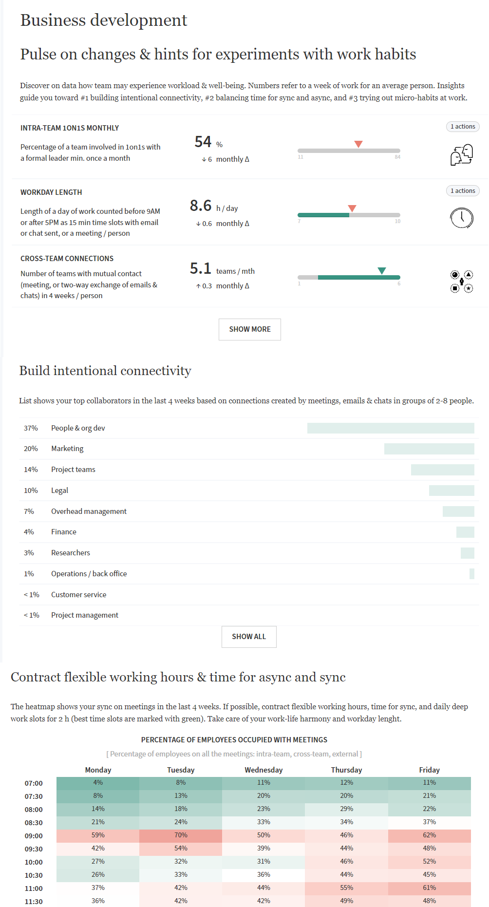 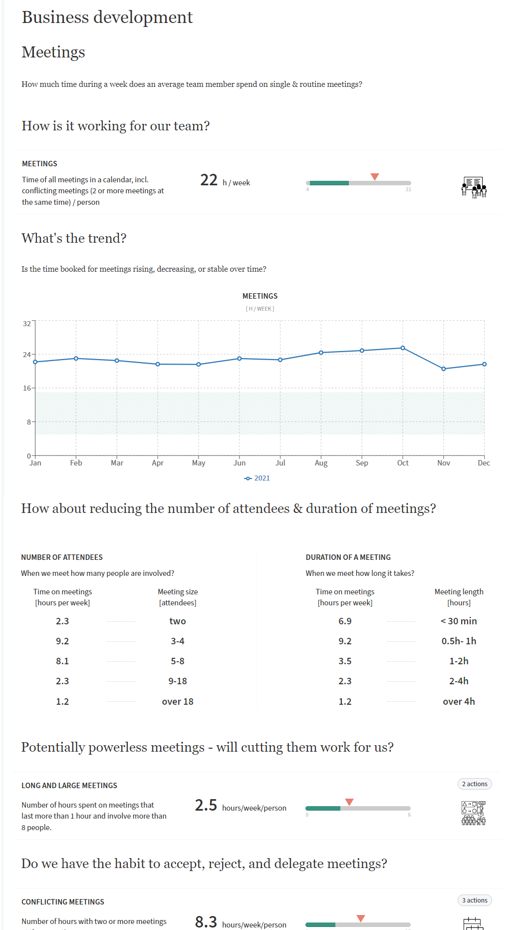  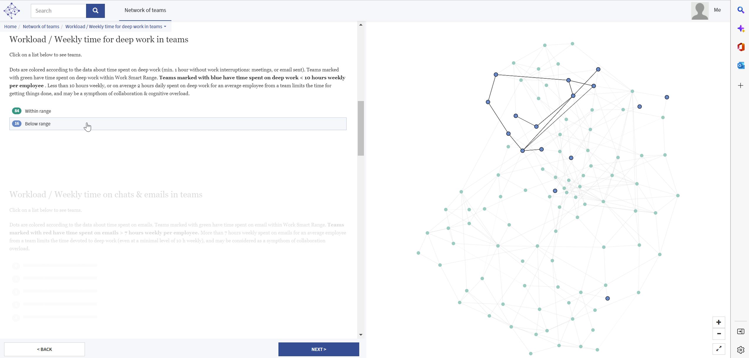 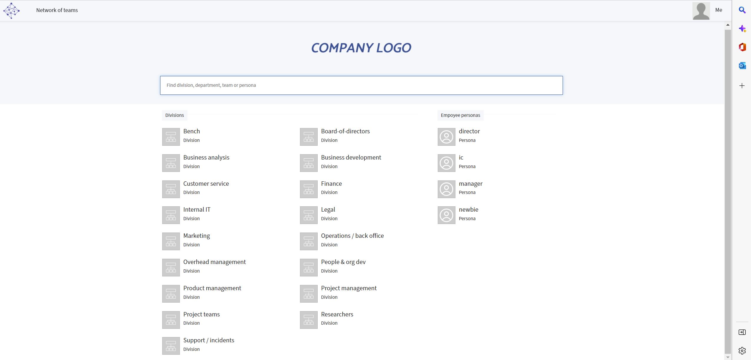 |