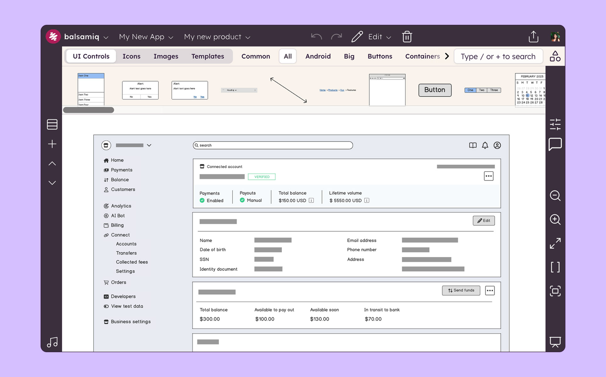
Balsamiq is a wireframing tool that helps lean product teams turn early ideas into clear, actionable direction. The tool helps product managers, founders, and engineers worldwide share concepts, reduce rework, and build better products.
N/A
Sketch
Score 4.6 out of 10
N/A
Sketch is a visual design tool of use for application prototyping, coming with a wide variety of extensions, plugins, and an active user community.
Balsamiq is excellent for creating low-fidelity wireframes where the designer is trying to communicate a general, loose idea of how the design should look. Because of this, it should be used early in the design stage, when there are still many decisions to be made about how the final design should look like. However, it is less suitable for situations where one wants to communicate a more final-appearing version of a design. There are limited functionalities (which appear intentional, as the Balsamiq website says that the tool "has 'just enough' prototyping capabilities, but not more”). Because of this, it is likely wise to choose a more high-powered tool, such as Axure, to create a fuller design toward the later stages of the design process
Sketch may still be a solid tool, especially for Mac-based designers focused on high-precision design and creating static design systems. However, Figma excels in real-time collaboration, cross-platform support, and interactive prototyping. If you need features beyond simple vector design—like collaborative prototyping or working across different operating systems—Figma is a more comprehensive solution.
Ease of use: Balsamiq is the easiest wireframing platform I've ever used. You will be able to learn how to work with the drag-and-drop interface in less than a day. Use familiar resizing controls (click and drag) to control elements. Familiar keyboard shortcuts for grouping, duplicating, undoing, and more make the platform incredibility intuitive.
Cartoony: I think Balsamiq's intentionally "cartoony" style is great. Again, this helps clients focus on the "what" on the page without spending too much time worrying about the actual look. We have a content-first approach. We always want to nail down the user-flow first before we delve into graphics.
Symbols: The symbols library did not exist when I first started using Balsamiq 7 years ago, but it's a great addition. Assign design elements to your symbols library within a project for easy re-use throughout multiple pages. This is a great way to maintain consistency in your design and reduce re-work. For example, if you copy-paste a footer on each page of your 10 page design, you will need to go back and update all 10 versions if you make a change. If you use the symbols library, you would only need to update it once.
Presentation: Presentation mode allows you to display a full-screen presentation. This is extremely helpful when walking through mocks with clients.
Linking: You can link elements of pages in a project together. This can help you illustrate functionality.
The project can get a bit laggy around 70-100 pages (on a MacBook Pro). It didn't happen to me but I've seen it in a presentation of a project and it froze in a moment and had to restart the app.
I don't find the design of the components very "pretty". It's totally subjective but still wanted to mention it. I know this is the style they have had since the beginning and it's almost something that identifies Balsamiq, but I think it can be improved.
The Sketch interface can feel a bit clumsy when you're working with a document that has many pages. As an example, I regularly work in a document that captures 10 different aspects of a product. Sketch doesn't allow me to organize all those pages into any type of folder hierarchy. I have to scroll through the complete list of pages to try and find the page I want. You can drag pages into a different order in Sketch, but that doesn't remove the lengthy list or provide visual demarcation between groups of related pages.
Nested symbols are extremely useful, but the interface available on the right panel of the screen to manipulate a nested symbol in a canvas is not clearly organized to find what you're looking for quickly. It displays as a list of items in your nested symbol with no visual delineation between objects, so it can be a bit of guesswork to make sure you're making changes to the correct element.
It would be nice if Sketch offered the ability to create a workflow with automatic connection of objects via lines and arrows, like a sitemap or process flow. I use Sketch to create all my screens, but still need to leave the app to create my visual diagrams in a separate app.
A fresh take on the UI to better delineate things visually would be a great help. As mentioned, pages can't be organized, nested symbols are cumbersome to read through, etc. Separating the main central area of the app where canvases are displayed visually from the tools on the left and right would make for a cleaner work environment.
Balsamiq is just so simple, intuitive and fast at creating wireframes. It has just the right amount of UI elements to get the job done without weighing you down with decision fatigue. If you really need something that is not there, you can either draw or import your own elements. I also like the way that you can organize your assets for reuse.
Sketch is a core tool for us and the cost to keep it going with our teams is low. It provides a good alternative to other screen design tools for our team members who prefer to use it.
Very intuitive and easy to understand. It only takes minutes to get the hang of it and get back to work. For new analysts (like, brand new, fresh out of school) it's not difficult and they need minimal to no hand-holding. The training content that is embedded is easy to find and use.
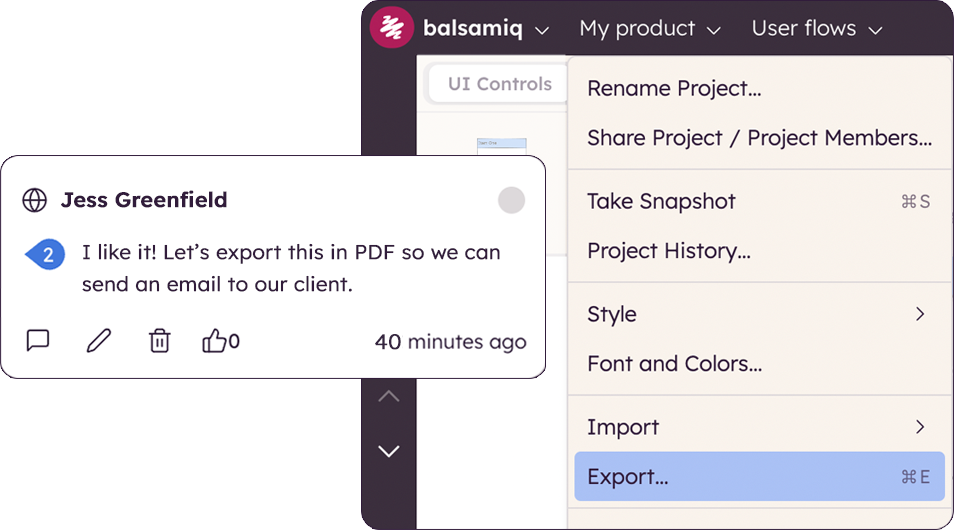
At the end of the day, it's just simple. This goes a long way in design and goes even further when your talking productivity, intuitive design and turnover rate. It's not difficult to figure something out even if it's not something your directly familiar with, i.e. if you want to export in certain file formats or change the size of the canvas, you don't have to delay your end product trying to figure it out. Similar situations took me less than 30 seconds to solve without a Google search. That's Usability.
The support is relatively decent, and they are quick to respond. However, their releases are not great. Sketch could use more robust testing of their software before releases. Over the last four years, I have had many days lost while waiting for Sketch to patch issues with their releases. It's actually a running joke in our office. So, support, good. Releases in the first place? Not great.
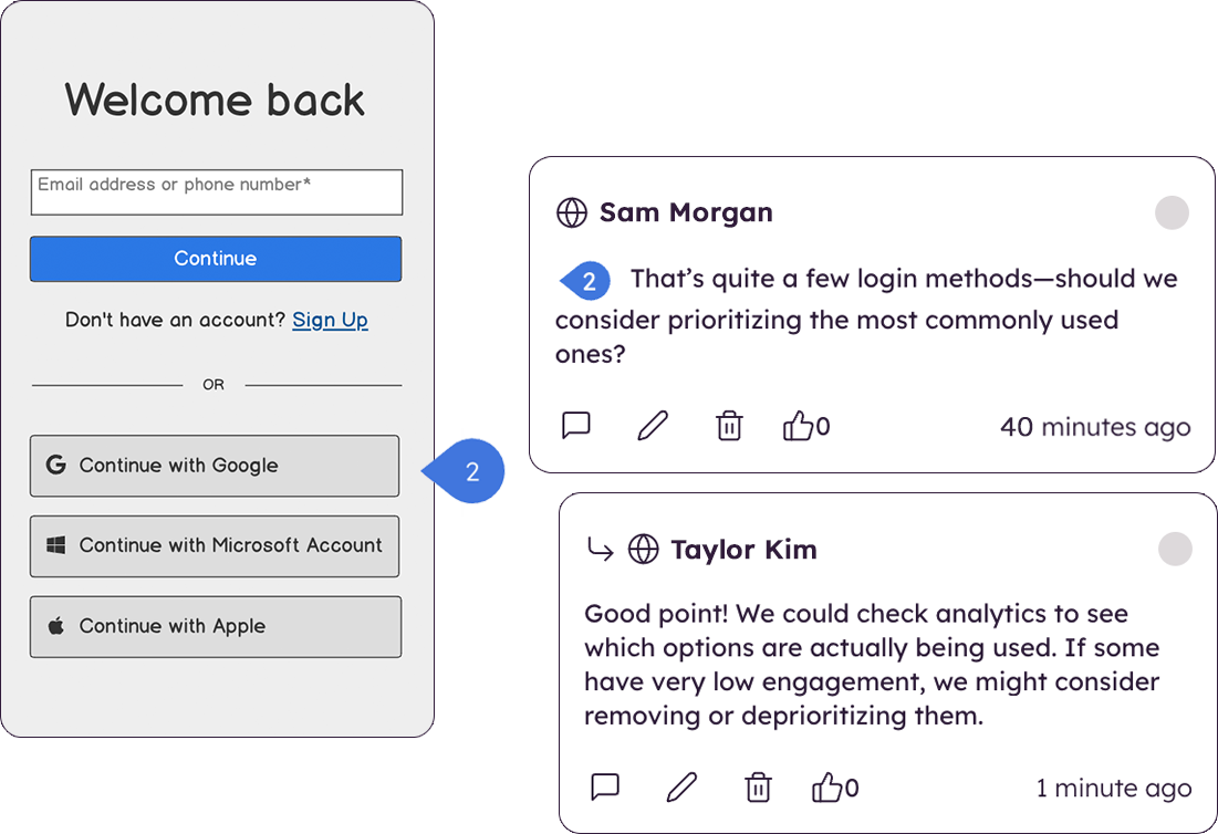
In the past I have just used HTML to mock up UIs, but as I've previously mentioned this can cause problems with user's thinking that the system is already built. Balsamiq is far quicker and easier to create wireframes, it is more collaborative and the resulting wireframes cannot be confused with a real system as they have a hand drawn feel to them.
I constantly use various tools, selecting the right one for each task based on my experience and understanding of their strengths. This allows me to combine the advantages of each tool to complete tasks more efficiently and achieve better results. For example, I primarily use Figma at work, but if I need to draw an icon quickly, I prefer Sketch and then export it to Figma.
The product works very well for showing product owners and developers design ideas for purposes of discussion, debate and refinement.
The products also works very well for specifying new designs for developers. This is best done in a series of screens that show various screen states and user interactions.
I also use the products to document bugs in software products and websites we have developed. This includes outlining and documenting bugs and changes to user interactions and refinements to the usability of completed interfaces and user experiences.
Saved time -- Intuitive interface saves us lots of time/money because it is reliable and easy to use. Other programs have caused serious confusion, leading to project delays.
More captivating wireframes -- Stakeholders have been finding it easier to visualize potential “final products” with vector-based Sketch designs. Because of this, we’ve been able to have more targeted, focused discussions that lead to improved final products (with fewer immediate post-launch revisions!).
Increased productivity -- Because Sketch is so easy to use, our designers have had more time to do more work. Rather than finagling difficult tools in previously used products, our designers feel no hesitation with Sketch, and are producing more often and more creatively.